Chet Raymo 2023
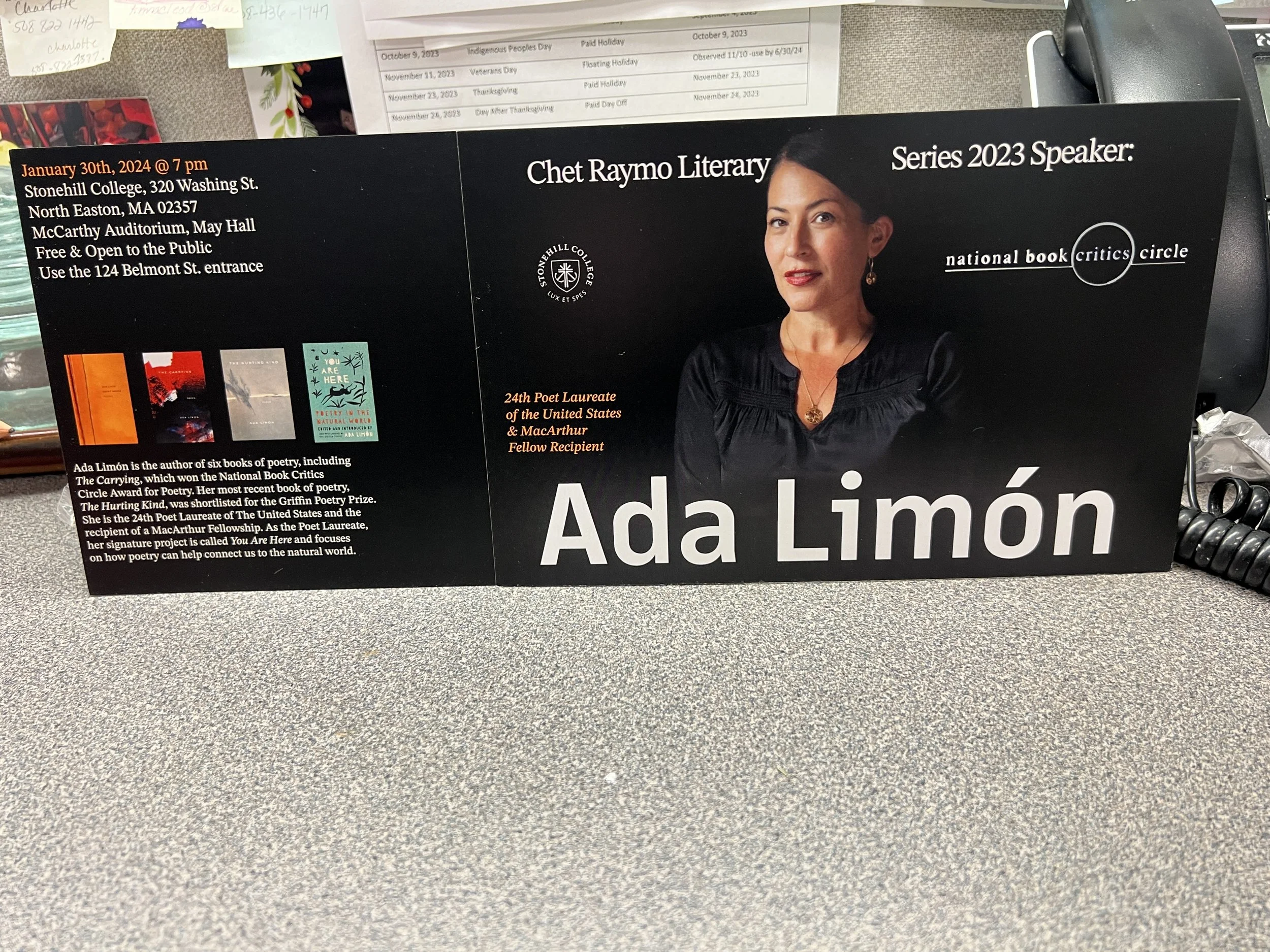
The client, a professor at Stonehill who runs this lecture series, wanted an eye-catching poster and postcard to increase the attendance rate at a poetry reading. This lecture series happens annually at Stonehill. To design the postcard and poster, Adobe Illustrator and Photoshop were used, and the assets aside from the typefaces were provided.
posterpostcard (front)postcard (back)The orange used for highlighting some of the text comes from one of the books Limón wrote.
The main focus is the poet, so the background is a lighter black than her shirt and hair so her face would stand out and catch the attention of those walking by. All of the supporting typefaces used are serifs because that style of font is used in her books of poetry. The primary typeface is sans-serif because of the contrast between it and the supporting copy and it conveys the boldness that the overall poster and postcard conveys.


layout: jen bradford · imagery: ada limón · copy: professor amra brooks


